Color theory plays a crucial role in art, influencing not only how artists create their works but also how viewers perceive them. The impact of color choices can significantly shape the composition of an artwork, evoking emotions and guiding the observer’s eye through the piece. By understanding the principles of color theory, artists can make intentional decisions that enhance their visual storytelling.
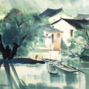
In different contexts, colors can convey various meanings and moods. For instance, warm colors like red and yellow often generate feelings of warmth and excitement, while cool colors such as blue and green tend to calm and soothe. The careful application of these principles allows the artist to communicate more effectively with their audience.
Additionally, color theory provides a framework for harmonizing colors in a composition. It helps artists create balance and cohesion, making their works aesthetically pleasing. Exploring the relationship between colors can unlock deeper insights into an artist’s intentions and the emotional journey they wish to take their viewers on.
Fundamentals of Color Theory
Color theory serves as the foundation for understanding how colors interact, combine, and influence visual art. It includes various elements like the color wheel, color harmonies, and the properties of color.
Understanding the Color Wheel
The color wheel is a circular diagram that organizes colors based on their relationships. Primary colors—red, blue, and yellow—are spaced evenly around the wheel. Secondary colors are created by mixing primary colors: green (blue + yellow), orange (red + yellow), and purple (red + blue).
Tertiary colors result from mixing a primary color with a secondary color, creating hues like red-orange or blue-green. This structure guides artists in selecting color combinations that achieve the desired effects.
Understanding the color wheel also helps in recognizing the relationships between colors, such as complementary (opposite on the wheel) and analogous (next to each other) colors. These relationships are essential for creating visual harmony.
Exploring Color Harmonies
Color harmonies refer to the pleasing arrangements of colors that enhance a visual composition. Artists often use specific combinations to evoke emotions and balance within their work.
Types of Color Harmonies:
- Complementary: Two colors opposite each other on the wheel, such as blue and orange. This combination creates contrast.
- Analogous: Colors that are adjacent on the wheel, like red, red-orange, and orange. These colors blend well together.
- Triadic: Three equally spaced colors, such as red, blue, and yellow. This approach offers vibrant contrast while maintaining balance.
Using these harmonies effectively can significantly influence the mood and impact of a piece of art.
Distinguishing Color Properties
Color properties encompass hue, saturation, and value, contributing to how an artwork is perceived.
- Hue refers to the basic color, such as red or green. It is the attribute that differentiates one color from another.
- Saturation indicates the intensity of a color; a highly saturated color appears vivid, while a desaturated color looks muted or gray.
- Value denotes the lightness or darkness of a color, affecting how colors contrast with one another.
Artists manipulate these properties to create depth, emphasis, and mood. Understanding these characteristics promotes better decision-making in color application for artistic expression.
Psychological and Emotional Dimensions of Color
Color deeply influences psychological reactions and emotional responses in viewers. Artists utilize this phenomenon to enhance their work’s expressive power, often drawing on color’s ability to evoke particular moods and perceptions.
Color in Artistic Expression
Artists like Claude Monet and Vincent van Gogh have demonstrated the power of color in their works. Monet’s use of light and color illustrates fleeting moments, creating emotional depth. His palette evokes serenity and introspection.
Similarly, Van Gogh used bold colors to convey intense emotions. His works often reflect psychological states, such as turmoil and joy, engaging viewers on a personal level.
Wassily Kandinsky emphasized color’s emotional impact, stating that it could evoke specific feelings and stimulate the mind. He believed that certain colors could resonate with certain emotions, such as blue for tranquility and red for passion.
Influence of Color on Mood and Perception
Color significantly affects mood and perception. Warm colors, like red and yellow, tend to evoke feelings of warmth and energy. They can stimulate and provoke action, leading to heightened emotional responses.
In contrast, cool colors like blue and green promote calmness and relaxation. They are often associated with tranquility and balance, influencing mood positively.
Mark Rothko’s color field paintings exemplify this effect, using large swathes of pure color to evoke profound emotional experiences. The simplicity of his work invites viewers to reflect deeply on their feelings.
Understanding these dimensions of color can enhance the artistic experience, allowing viewers to engage more fully with the art.
Color and Design in Practice
Color plays a pivotal role in design, influencing aesthetics, branding, and the overall emotional response to a piece of art. Different art forms employ various color schemes to achieve specific effects and convey particular messages.
Color Schemes in Various Art Forms
Artists and designers often utilize different color schemes to create visual harmony. Among the most prominent are:
- Analogous Color Scheme: This involves using colors that are next to each other on the color wheel. It creates a serene and comfortable palette often seen in landscapes.
- Complementary Color Scheme: This scheme employs colors from opposite sides of the color wheel. The contrast adds vibrancy and can generate dynamic visual interactions, frequently found in graphic design and branding.
- Triadic Color Scheme: Composed of three colors that are evenly spaced around the color wheel. This approach offers balance and vividness, enhancing the energy in interior design and art pieces.
Each scheme serves unique purposes in varying contexts, such as fashion design and architecture.
Strategies for Effective Color Use
To master color application, certain strategies are beneficial:
- Understand Color Psychology: Colors evoke specific emotions. For instance, blue can elicit calmness, while red may evoke excitement. Designers must consider the emotional impact on viewers.
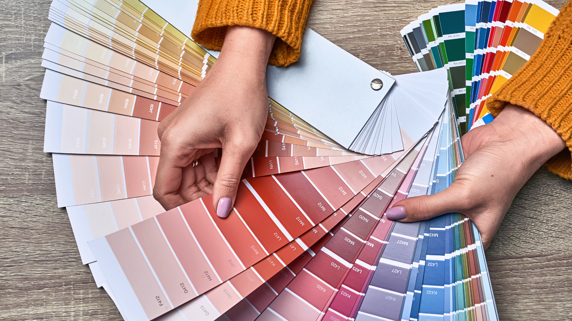
- Create Cohesive Color Palettes: Establish a limited color palette that shares a common undertone. This technique ensures consistency across branding and design projects.
- Experiment with Contrast: High contrast can draw attention and create focal points, particularly in graphic and web design. It is essential to use contrasts thoughtfully to enhance readability.
These strategies, rooted in historical perspectives by figures like Isaac Newton and Johann Wolfgang von Goethe, help achieve desirable outcomes across various creative disciplines.
Historical and Cultural Perspective on Color
Color has held significant meaning throughout history and across cultures. Its evolution in theory and symbolism reveals much about human creativity and perception. The following subsections examine this progression and its implications in art and culture.
Evolution of Color Theory
The understanding of color began with early civilizations that categorized colors based on natural elements. Ancient Egyptians, for instance, utilized color in their artwork to convey emotions and spirituality.
Over time, significant advancements emerged in color theory. In the 17th century, Isaac Newton introduced the color wheel, showcasing the spectrum of light. This scientific approach laid foundations for artists, leading to further exploration by figures like Johann Wolfgang von Goethe, who emphasized the psychological aspects of color.
The 20th century saw a notable shift with the rise of modern art and abstract expressionism, where artists such as Henri Matisse employed vivid colors to elicit emotional responses, going beyond mere representation.
Color Symbolism Across Time and Cultures
Color symbolism varies greatly across different cultures and historical periods. For example, red often symbolizes love or power, while blue can signify peace or sadness. In ancient China, red represented good fortune, contrasting with its meanings in certain Western contexts.
Artists have utilized these associations deliberately. Claude Monet’s impressionist works used color to capture light and atmosphere, while Matisse employed bold hues to express his emotional landscape.
Throughout history, colors have maintained their significance in rituals, politics, and art, illustrating the complex relationship between society and visual impact. Mastery of color symbolism enables artists to communicate deeper meanings, making it a vital aspect of artistic expression throughout time.